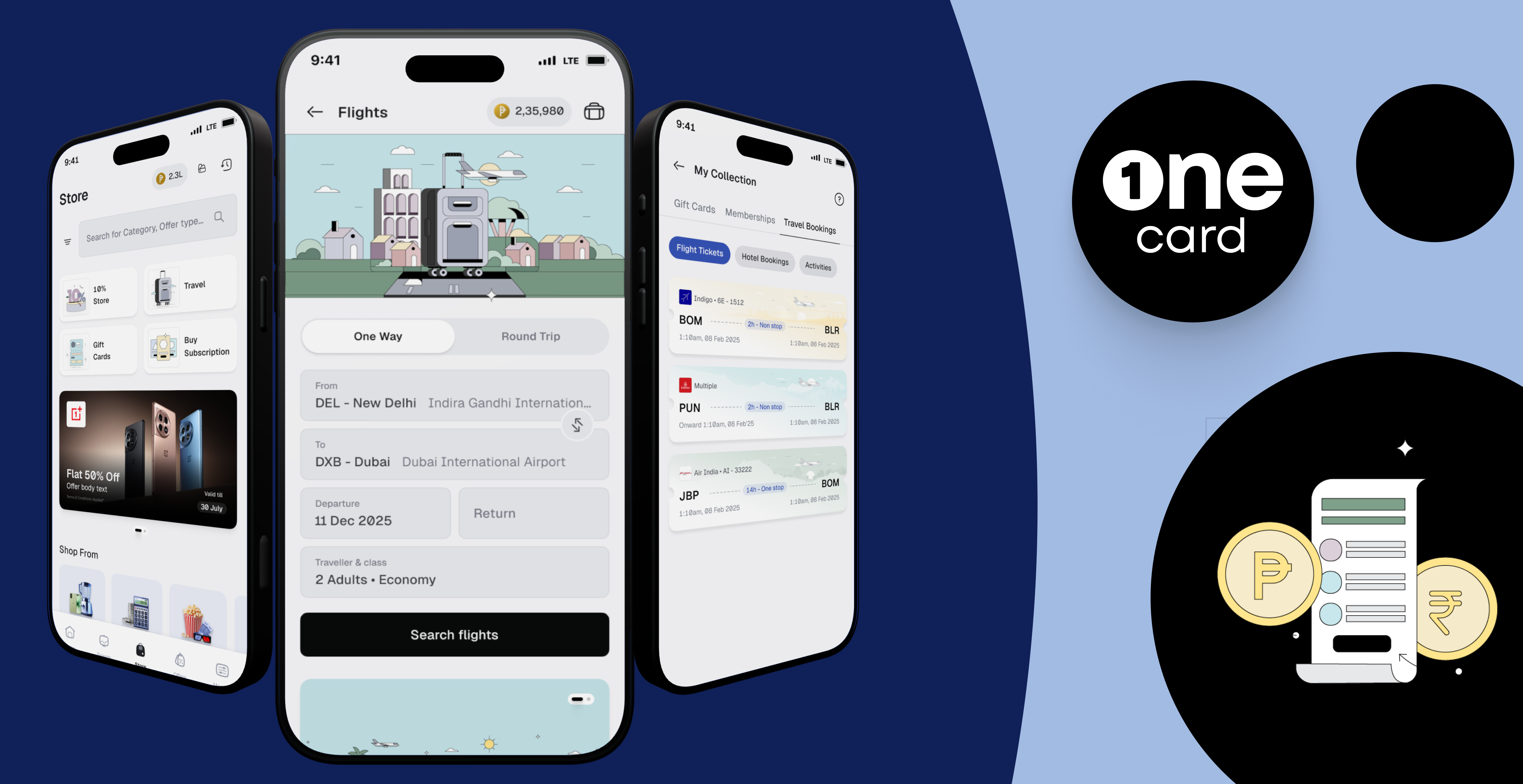
Turning a Zero-Revenue Feature into ₹2.6 Crore/Month
The Background: A Feature That Made
Earlier we had a section in our app called OneTrips. It was basically a utility tool. Users could check forex rates or calculate how much a trip to Paris might cost. People used it, but it had a major business flaw: it made zero money.
Meanwhile, our data showed our credit card users were spending a lot of money on flights, but they were doing it on MakeMyTrip or airline websites. The business team saw an opportunity to generate a completely new business model within OneCard. If we could let users book flights directly inside the app, we could take a good margin on every ticket.
What is OneCard?
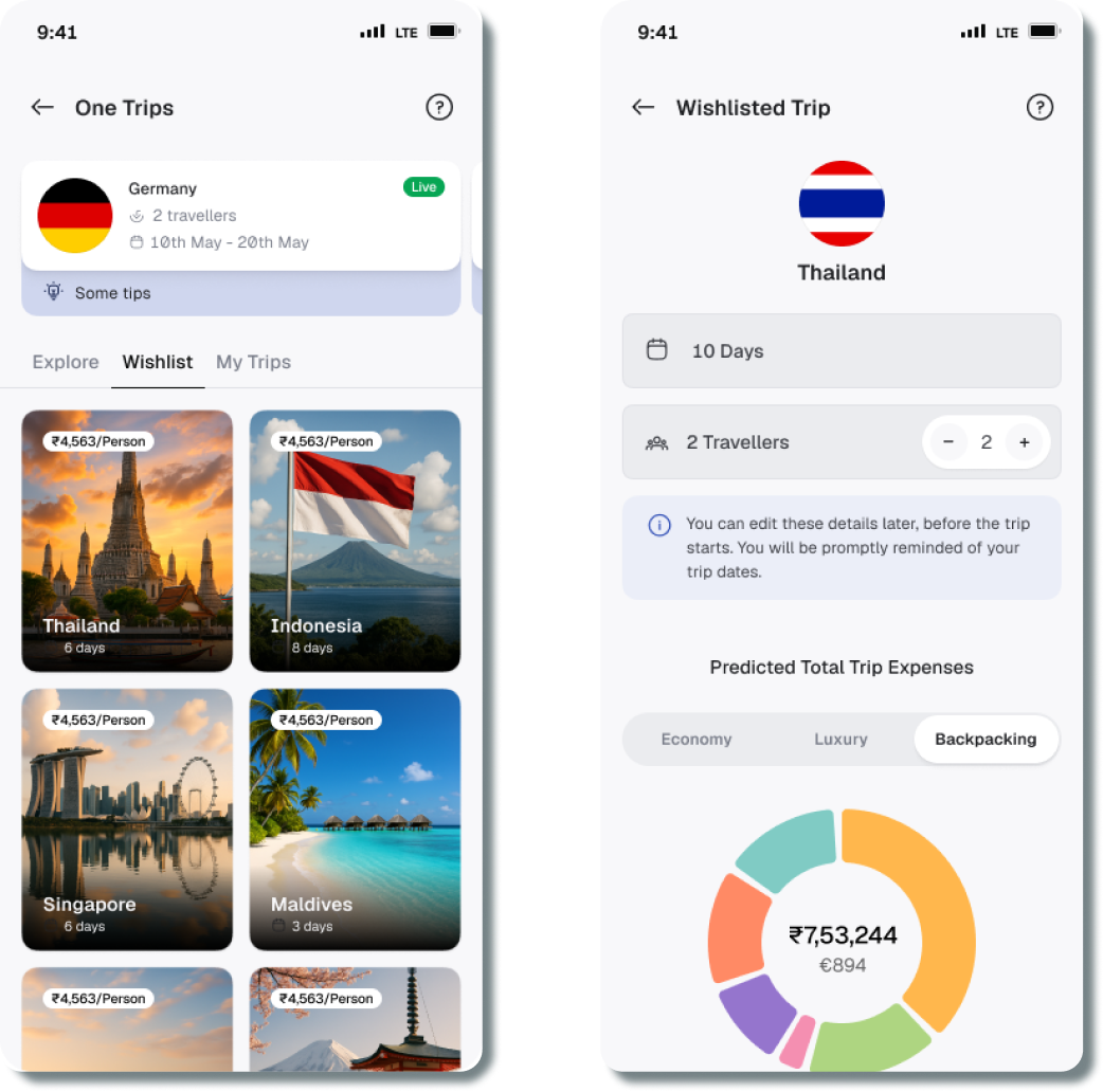
OneCard is a premium, mobile-first credit card company in India.
- The Customer Base: Our users are primarily young, tech-savvy professionals and millennials. They have zero patience for traditional banking clunkiness and expect a 100% digital, fast, and modern experience.
- Unique Features: OneCard is famous for its physical Metal Card, but the real product is the app itself. The entire credit lifecycle is managed in-app—from 3-minute onboarding, to locking the card, to a simple "swipe-to-convert" EMI feature. Our biggest differentiator is our reward points system, which acts like liquid cash rather than useless catalog points.

The Challenge & Problem Framing
Building a flight booking engine from scratch in 30 days and going live is impossible. So, the business partnered with a B2B travel company called OnArrival.
- What is OnArrival? OnArrival is a B2B travel technology provider. Rather than building a consumer-facing travel app like MakeMyTrip, they build the backend infrastructure—the APIs and booking engines for flights, hotels, and experiences. They allow companies like OneCard to plug travel booking capabilities directly into their own platforms without having to build a massive travel inventory from scratch.
They had the backend booking tech, but we needed to build the front-end experience inside our app.

How Might We?
Co-design and integrate a third-party flight engine into OneCard so seamlessly that users trust it enough to spend thousands on a ticket, while sticking to a strict deadline?

Setting the Stage: The OneCard Philosophy & The Currency
Before jumping into the design execution, there are two foundational pieces of context you need to know to understand how we built this product: our strict UX philosophy and how our currency works.
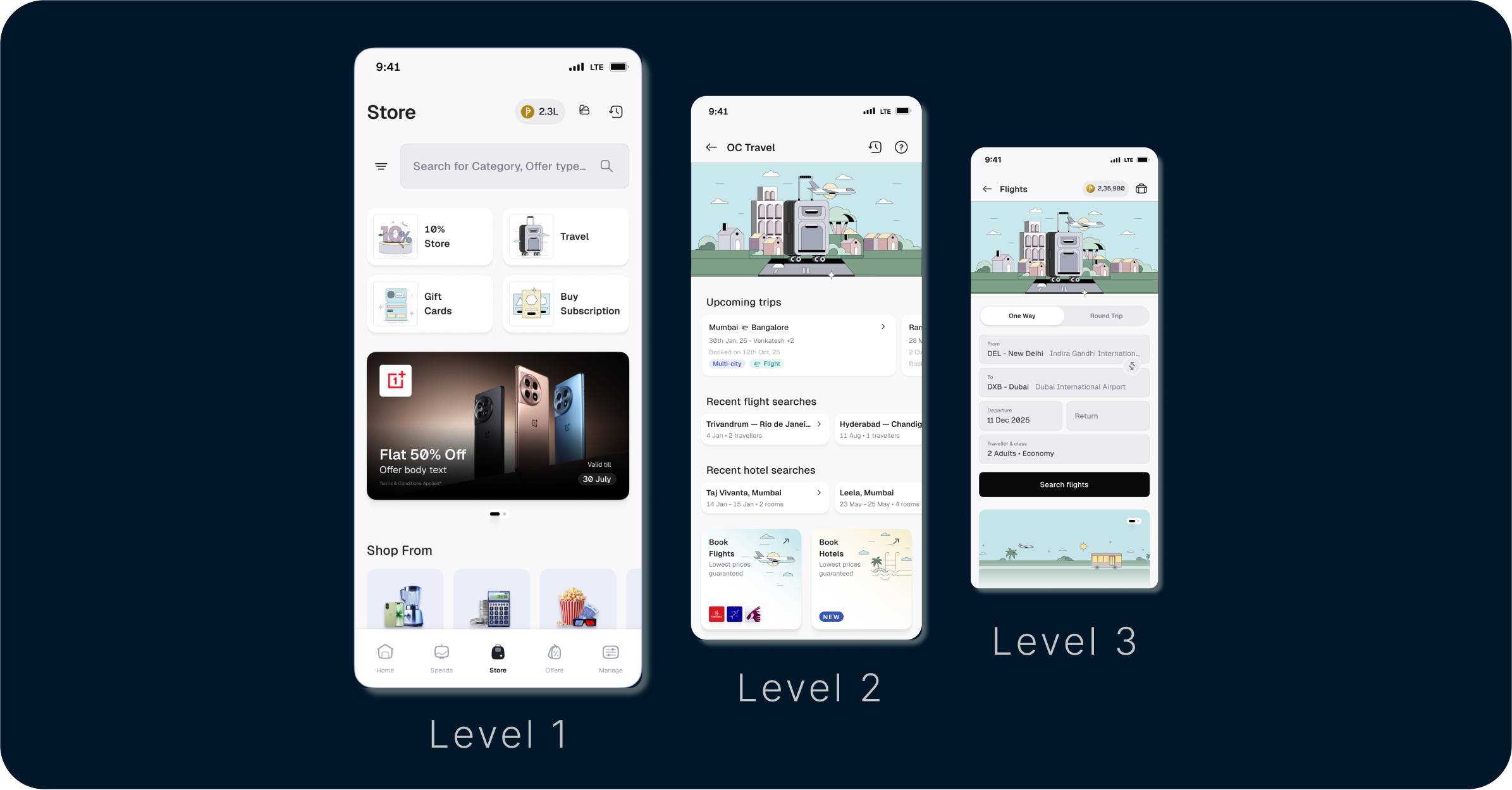
1. The OneCard UX Philosophy: The 3-Tap Rule At OneCard, we do not believe in deep, nested menus. We have a strict architectural rule: a user should never be more than three taps away from executing any task. We structure the entire app across three distinct levels:
- Level 1 (The Hubs): The persistent bottom navigation bar (Home, Spend, Store, Offers, Manage).
- Level 2 (The Categories): The sub-sections inside a tab. For example, tapping "Travel" inside the Store hub.
- Level 3 (The Action): The end-state screen where the task actually begins. No information or page is allowed to exist deeper than Level 3.
When we integrated the partner's flight engine, our biggest constraint was forcing their complex booking logic to fit inside this exact 3-tap framework.
2. The Currency: Reward Points The entire hook of our flight booking experience relies on OneCard Reward Points. Every time a user swipes their OneCard, they earn points. Here is the basic math:
- Earning: Users get 1 Reward Point for every ₹50 spent.
- The Value: 10 Reward Points = ₹1.
Most credit card apps make you redeem points for useless catalog items like toasters or gift cards. OneCard allows users to use points like pure cash. So, if a user has 20,000 Reward Points sitting in their app, they effectively have ₹2,000 in cash. By surfacing this math directly on the very first flight search screen—subtracting their points from the airline's cash price—we turned a confusing loyalty metric into immediate, hard purchasing power. This single design decision became the ultimate hook for driving our revenue—which I'll break down for you in the final numbers.
Building the Plane While Flying: The Partner Collaboration
Because of the tight 30-day deadline, this wasn't a standard textbook design process. OnArrival didn't hand us a polished UI or a ready-made frontend to plug in. They provided the backend booking engine and a very rough, bare-bones UX framework. It was up to us to turn their raw logic into a premium OneCard experience.
First, my lead and I had to map out the architectural ownership: What flows does our internal team build, and what screens does OnArrival’s engineering team build based on our designs?
- The Core Shell: We built the entry points (the "Travel" tile in L1 and “Book Flights” in L2), the native checkout, the "My Collections" vault(where the final tickets are stored), “History page”.
- The Booking Engine Flows: OnArrival built the actual search and itinerary selection screens, but we dictated the design. We essentially treated their frontend team as our own extended engineering team.
Our Design Process
When you're racing against a strict timeline, a textbook design process goes completely out the window. I had to use a highly condensed, constraint-driven approach. Here is how we broke down the integration to actually get it done at scale:
- Rapid Co-Design: My lead and I focused on designing the complex interactions and value-adds. To keep up with daily partner reviews, I used AI tools purely as an assistant to rapidly generate visual placeholders and draft error microcopy, freeing me up to focus 100% on the flow logic.
- Token Handoff: We handed OnArrival our exact design tokens so their team could start building initial screens using our visual language.
- Constraint Mapping: We mapped OnArrival’s backend logic against OneCard’s strict '3-tap' design philosophy to figure out exactly what screens we needed.
Stitching it Together
Because two different teams were building different parts of the journey, the biggest risk was that the app would feel disjointed. At OneCard, we have a strict UX philosophy: A user should never be more than 3 taps away from starting a task.
Here is how we stitched the happy flow together to respect that rule:
- Tap 1 (Native): You start on the main 'Store' tab.
- Tap 2 (Native): You tap the 'Travel' tile.
- Tap 3 (The Handshake): You hit 'Book Flights' and land directly on the flight search page.
From here, you are technically using the screens built by OnArrival. You search, pick a seat, and lock in your details. But because we ruthlessly reviewed their designs, you never feel like you left OneCard.
Then comes the final stitch: The moment you hit 'Proceed to Pay' after confirming itenary, we instantly pull you back to our native OneCard payment page. One swipe, you're done, and the final ticket drops right into your native 'My Collections' vault. It feels like one, unbreakable journey.
The Invisible Handshake: Keeping Users Calm on Slow Networks
When a user taps 'Search Flights', we hand them over to the partner-hosted flow while fetching live airline inventory. On a slow network, this takes a few seconds. If users see a blank screen or a generic spinner here, they might panic and drop off.
To fix this, I designed a transition screen featuring dynamically rotating loading texts—shifting smoothly through copy like "Searching the skies for best deals," "Your travel adventure is loading," and "Navigating to your flight options." This psychological trick keeps the user actively engaged, masking system latency and keeping trust intact while the backend loads.
Upfront Rewards (Why book with us? )
We needed a hook. Why would a user book here instead of our competitors? Because we already know the user's OneCard point balance, we did the math for them on the very first search screen.
Instead of showing a flight for ₹6,000, our UI showed: "₹4,200 + 18,000 Points." Seeing that massive price drop instantly stopped users from closing the app to compare prices elsewhere.
Handling the Edge Cases
Good UX is about handling the messy details. For example, airlines have a rule: you cannot mix special fares (like Senior Citizen or Student) with child tickets.
When I tested competitor apps, they handled this poorly. They let the user select adults and a child on Senior Citizen Fare, let them hit "Search," and then threw a frustrating error screen making them start over.
We took a proactive approach:
- If a user selects a "Child" passenger, the "Senior Citizen" fare option instantly greys out.
- If they try to tap it anyway, a smooth pop up opens up explaining: "Senior Citizen fares are available for adult passengers only."
We stopped the error before the user could even make it.
The Results: What Happened Next
We went live on March 1, 2026. By our first full month of stable tracking in April, the funnel metrics through August proved our design and integration strategy worked:
The Payoff: Remember those upfront reward points? Showing the discount immediately on the search screen completely broke the user's hesitation to spend. Here is how that specific design decision paid off:
The Post-Launch Reality Check: Ensuring Reward Visibility
While showing upfront reward points on the search results page successfully hooked users, post-launch data and user behavior pointed to a hidden flaw: we went silent about those rewards during checkout and post-booking. We realized that once the user moved from the search cards to the payment screen, the reward point callout completely disappeared.
- The Risk: This created sudden friction and doubt. Users second-guessed whether they were actually getting their promised value-back right when they were about to input their money.
- The Fix: We audited the entire bottom-of-funnel flow and added persistent reward confirmation banners across the Payment Details screen and the Success/Ticket Details page, explicitly reminding them of their bonus value-back.
Looking Back: My Key Learnings
What's Next?
Right now, flights are standalone transactions. Our next step is treating travel as a package—if you book a flight to Dubai, we want to suggest hotels, activities, and one-click visa integrations to build a complete travel itinerary.
For your time !!!