Helping Drive 2.2× Flight Booking Conversion by Building a Scalable Travel Ecosystem

How we fit a partner's booking engine inside the OneCard app, used reward points to win the booking, and built it to take hotels, visas and experiences later.
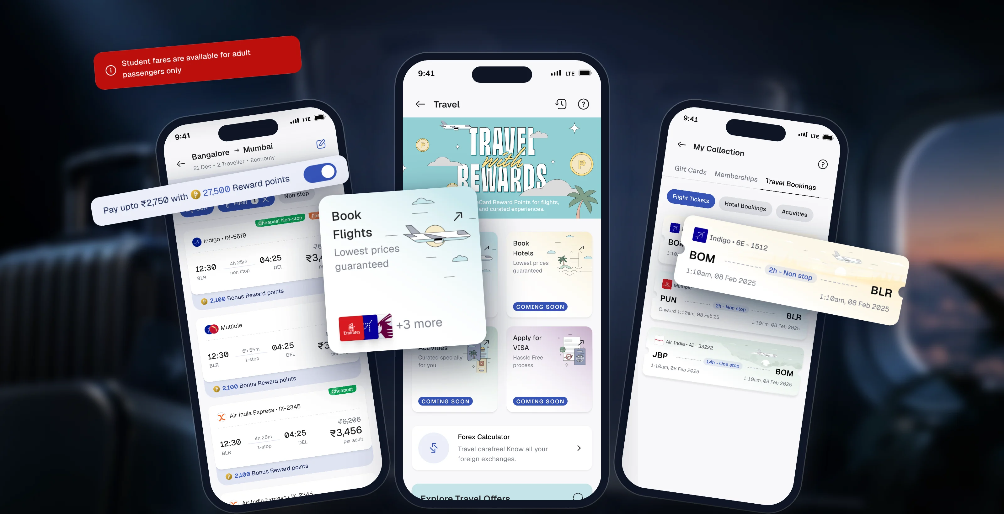
We had to fit a partner's web app inside ours, and design everything around it
What's ours, and what's theirs?
Two teams, two codebases, one journey.
How do we hide the seams?
Every jump between apps can feel broken.
Why would anyone book here?
MakeMyTrip is one tap away.
How do we build for what's next?
Hotels, visas and experiences would follow.
Four rules we had to design within
Flights first, but built so hotels, visas and experiences could slot in later.
No task more than three taps from the bottom nav, whatever the partner's flow needed.
Two codebases, two design teams, but users should never feel the join.
Travel had to earn its place in a credit-card app, never compete with it.
We started with the business and the user, then worked our way to the screens
No screen ships without its empty and error states. We design for the first visit, the failed load and the lost connection, not just the happy path.
Travel only makes money if people prefer booking here
- Book fast
- Get the best realistic price
- No doubts after booking
- Travel is seen and used
- A clean partner integration
- More reward points redeemed
- The partner engine stays invisible
- Trust at the moment of payment
- Room for more categories
We talked to 10 cardholders who already booked flights elsewhere
- Search
- Where people decideResults
- Fare review
- CheckoutJust where they pay
Biggest findingPeople decide where to book on the results page, right after they see prices. Checkout is just where they pay.
Everyone competes on fare. Nobody keeps the price the same till payment.
| App | Same price, search to payment | Points usable in the app | Offers shown upfront | Updates after booking | Coverage |
|---|---|---|---|---|---|
| MakeMyTrip | 1.5/4 | ||||
| Paytm | 1.5/4 | ||||
| EaseMyTrip | 1.5/4 | ||||
| Skyscanner | 0/4 | ||||
| Booking.com | 1.5/4 | ||||
| OneCard, our design | 4/4 |
Two codebases, two product teams, one journey
With the whole journey on one line, the plan was clear: own the way in and the payment, and make every jump between the two apps feel like nothing happened. We shared our design tokens with the partner up front, so both teams built from the same base.
OneCard appFlight partnerFollow the line left to right. Each drop is a handoff between the two apps.
OneCard appOur screens, our codebaseOneCard appour code- 1Into the PWAA few seconds of load, so we designed the wait.
- 2Back to usSame fare and reward points carried into checkout.
- 3After bookingHistory and My Collection both open the partner's booking details.
We worked it out on whiteboards first
Entry points, the Travel page structure, every trip state and the checkout timer, worked out with the team on whiteboards. Tap a board to read it.
- What came off the boards
One Travel hub for every category, a way back in for every trip state, and a checkout that handles its own timer.
We put everything side by side and kept what served both the user and the business
-
Interviews
I earn points but can't use them there.
Points only work inside OneCard: our edge. And people choose on the results page. -
Interviews
The price goes up on the last screen.
Keep one price from search to payment.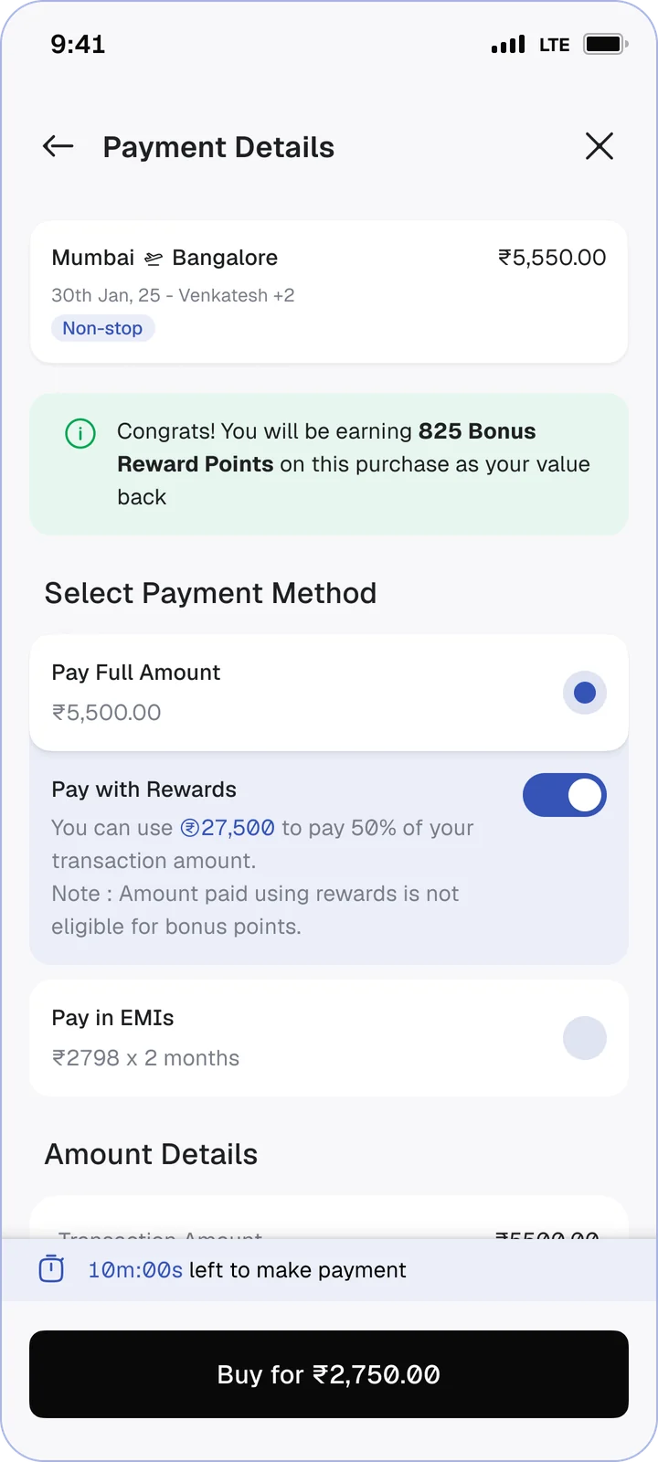 One price from search to paymentSee it ↓
-
Interviews
I don't know which offer applies until I pay.
Show savings upfront, where the decision happens.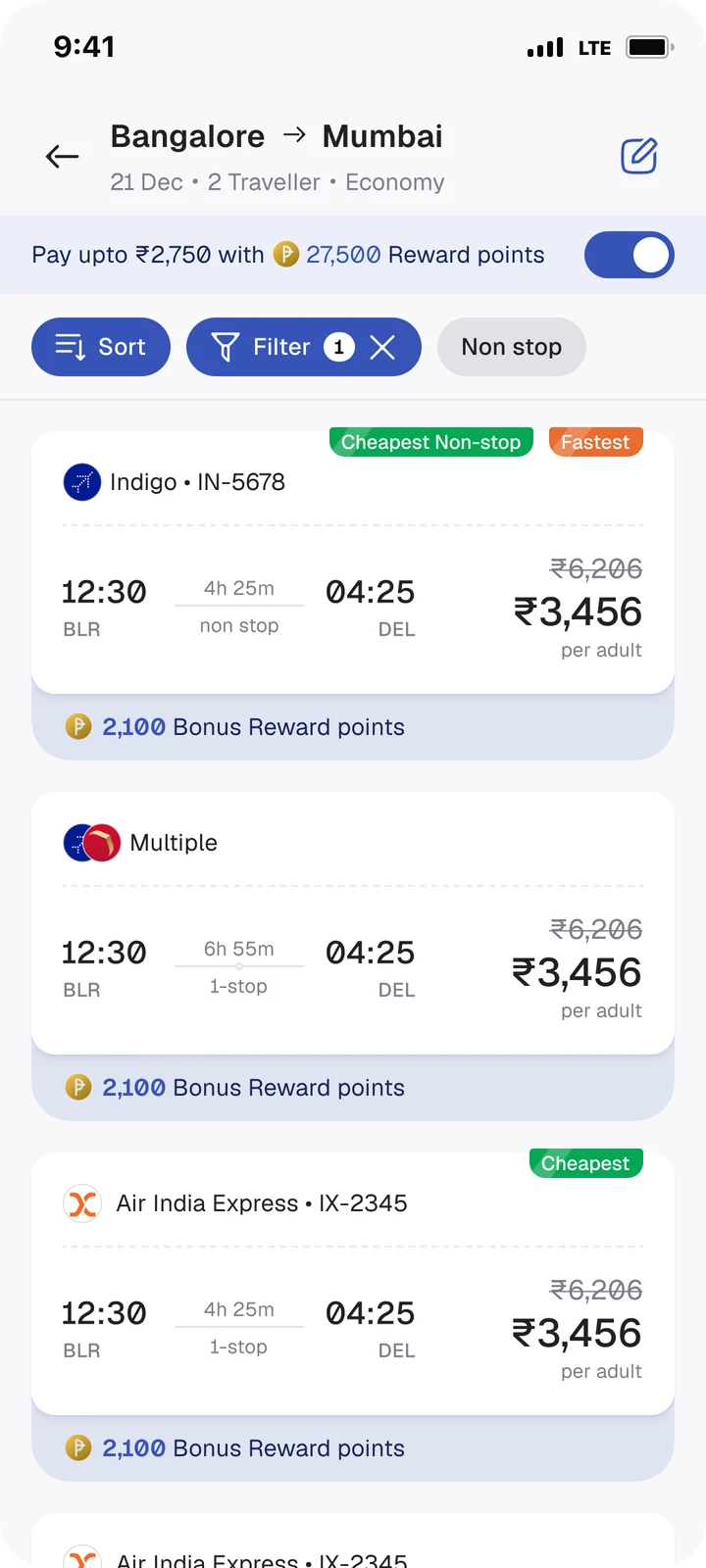 The points discount on results, not just at checkoutSee it ↓
-
Competitor reviewOther apps let you pick fares that can't work.Stop the error before it happens.
 Disable the invalid fare, explain why on tapSee it ↓
-
Journey mapOpening the partner's app takes a few seconds.Design the wait, so the jump doesn't feel broken.
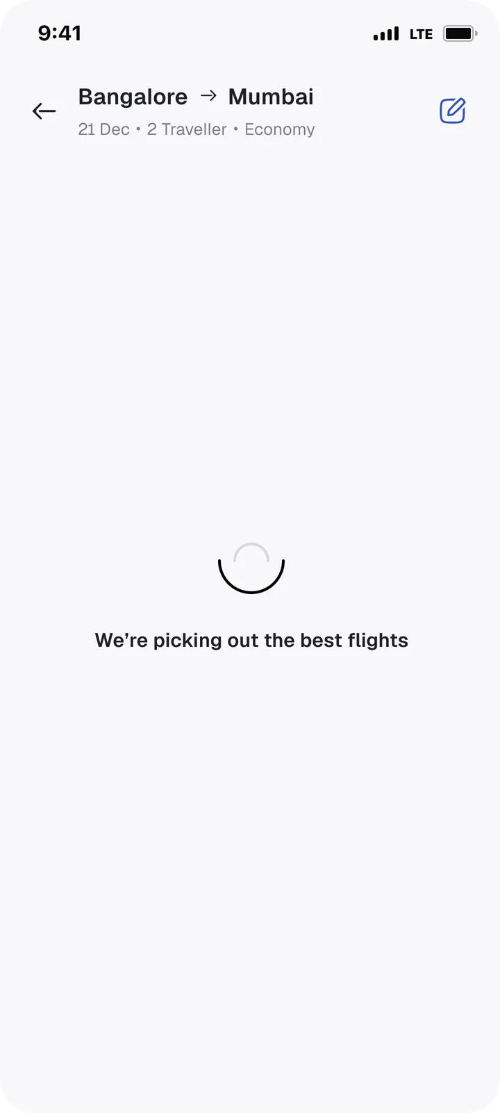 A loading state with changing messagesSee it ↓
-
Journey mapA ticket is a payment and something you keep.Give it a home for each job.
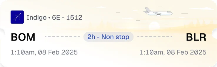 History for the payment, My Collection for the ticketSee it ↓
Making room for Travel in the Store
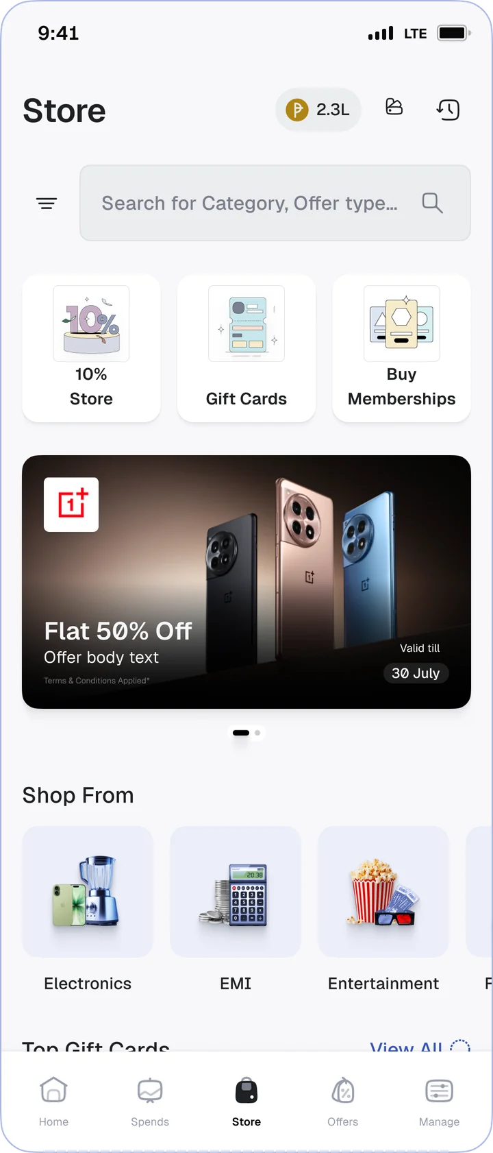
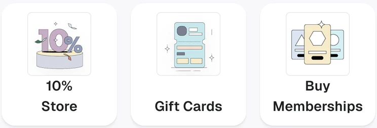
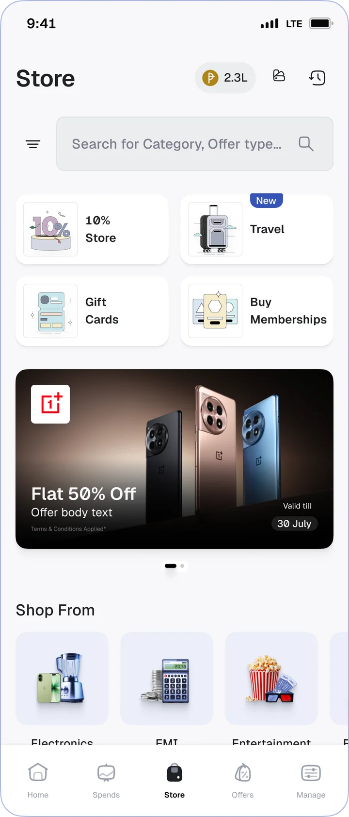
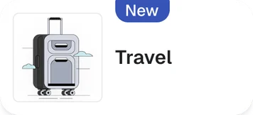
Travel had to live in the Store, next to everything people already bought there. The top of the Store had three cards: 10% Store, Gift Cards and Memberships. Instead of squeezing a fourth card into that row, we reworked it into a 2×2 grid with Travel as the new tile. That put Travel two taps from the bottom nav, without pushing anything else out.
Show the reward points discount on the results page, not just at checkout
OneCard reward points are earned on every spend but can only be used inside OneCard (10 reward points = ₹1). No other app can match that, so we put them where people actually decide.
On by default, so every fare shows the price after reward points.

The results page was the partner's, so this was a pitch, not a design change. They didn't push back; they just needed the why: if the cheaper price isn't visible while people compare, our reward points can't win the booking.
Stopping a fare error before it happens
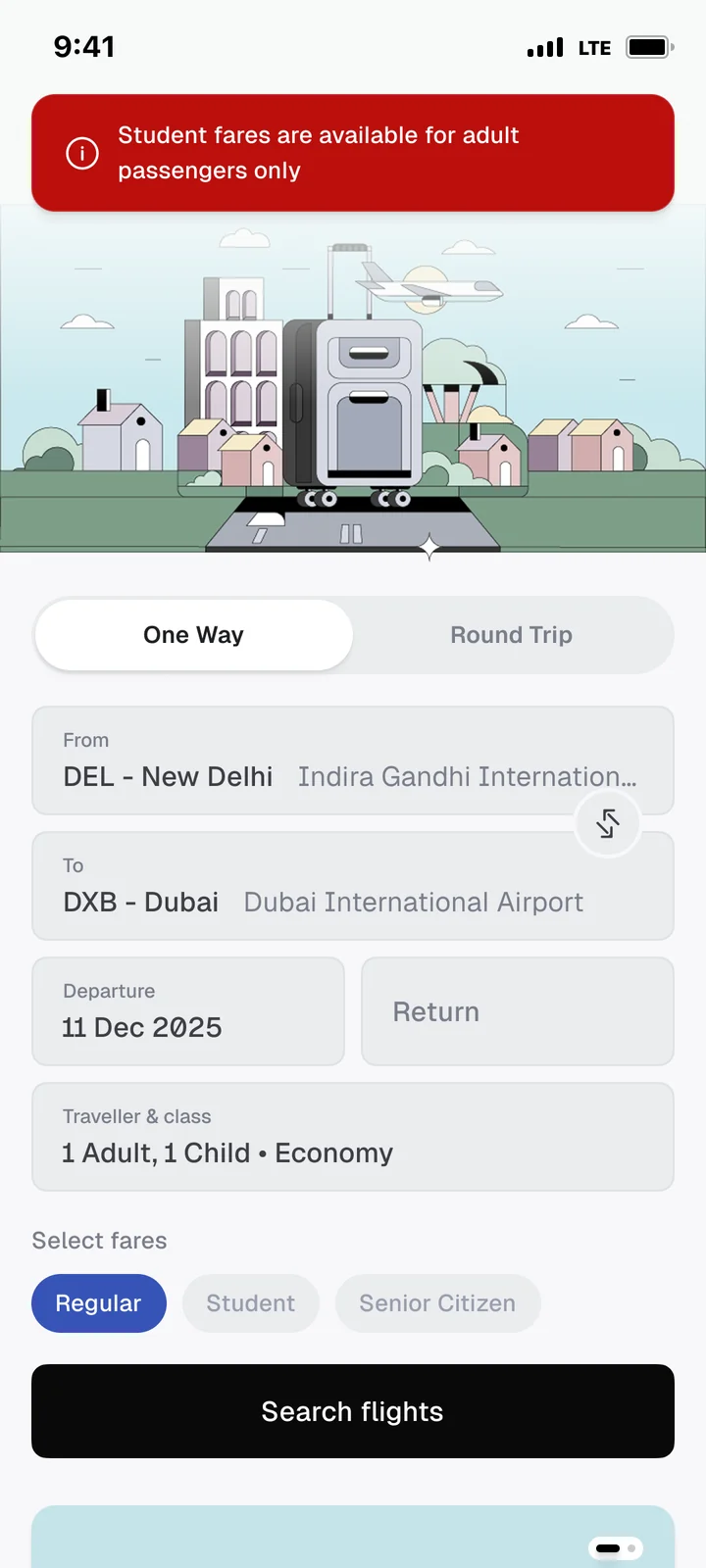
Other apps let you add a child as a traveller, pick a student or senior citizen fare, and only tell you it's invalid after you search. The partner's first version did the same. I pushed for a different rule: the app knows the combination won't work before you tap search, so it shouldn't let you get that far.
Lets you enter or select the fare, then won't let you continue until you change it.
Searches anyway, flashes an error, and quietly switches to regular fares.
Add a child, and fares that don't apply, like student or senior citizen, are disabled. Tap one, and a short message explains why.
With a child on the booking, tapping student or senior citizen explains why it isn't available.
Making the jump between two apps feel like one
Into the partner app. Their web app takes a few seconds to open, and a blank screen reads as broken. We added a loading state with messages that change as it loads, so the wait felt like progress.
Changing messages while the partner app opens, then straight into results.
Back to OneCard. Payment happens in our app, so the fare, reward points and fees had to match the partner's results to the rupee. Any change at this point feels like a bait and switch.
The same fare, reward points and fees people saw on the results page.
Keeping people updated between booking and the flight
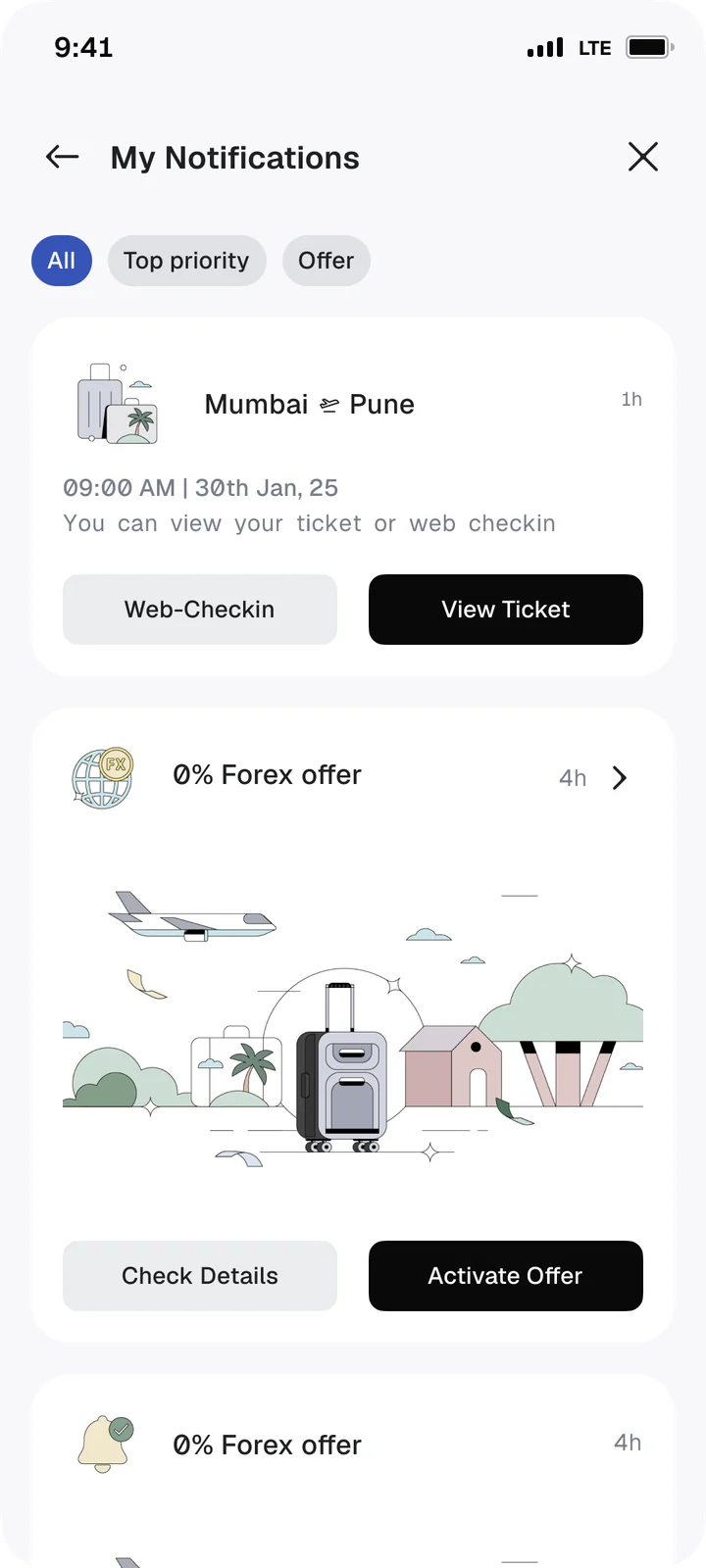
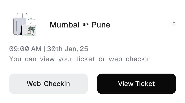
A booking isn't finished at payment. Every booking stage was pinned in the in-app notification hub, with web check-in and the ticket one tap away, and the same updates went out on WhatsApp and email.
Every booking stage pinned in the in-app notification hub, with web check-in and the ticket one tap away.
Flights were the first category, not the whole product
Every native piece had to work for booking types that didn't exist yet. The test I kept using: when the next category arrives, does it need a new screen, or just new content?
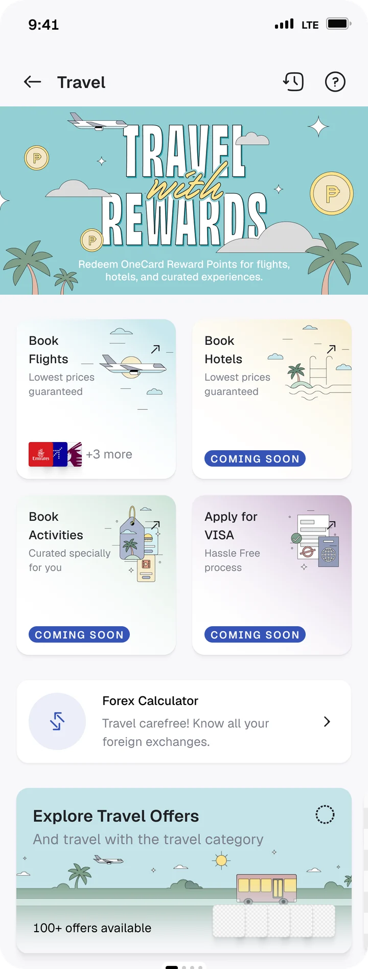
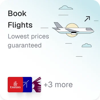
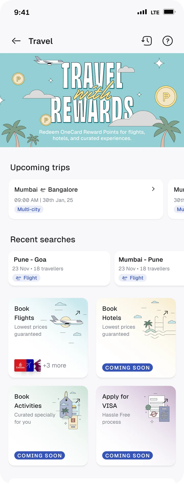
Travel page as a hub. Categories are tiles next to upcoming trips and offers. A new category adds a tile, not a page.
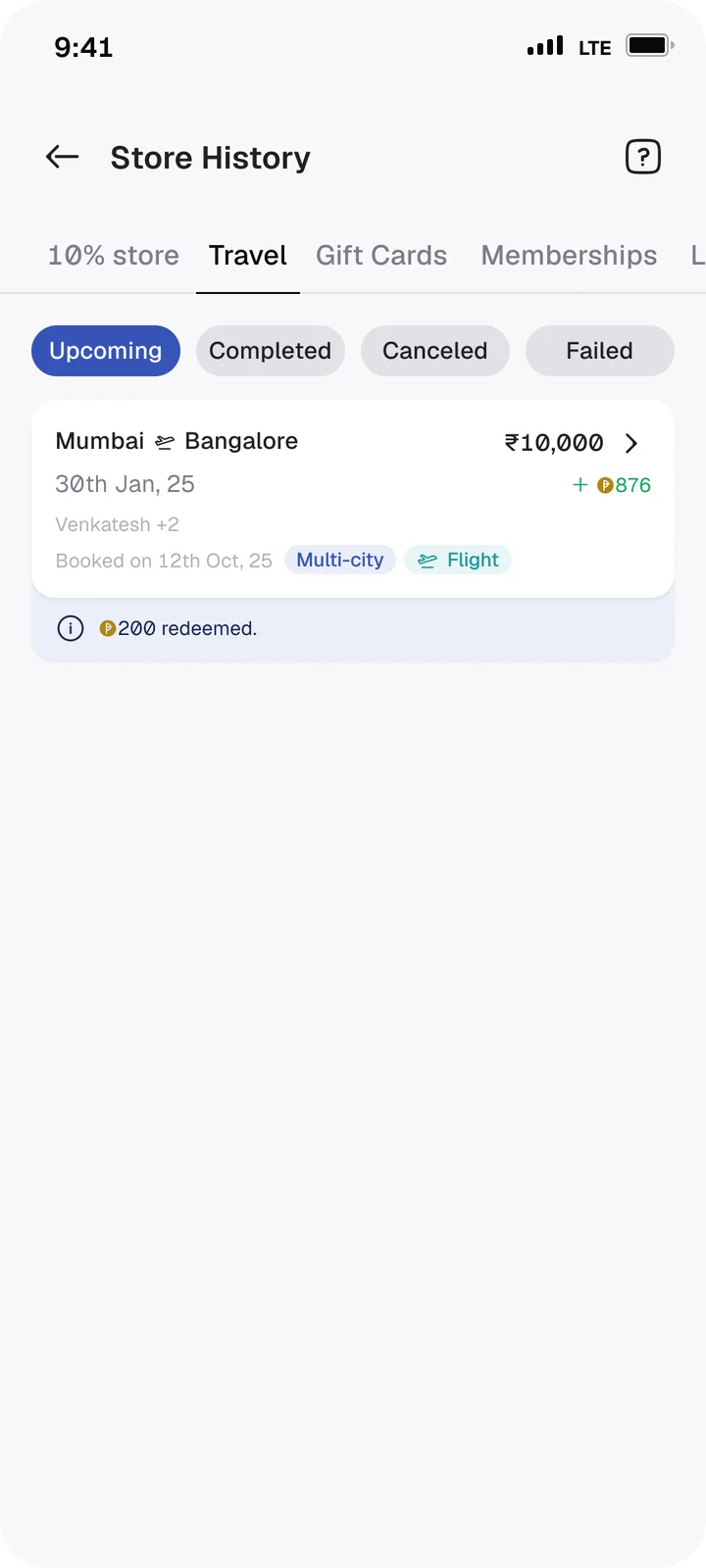
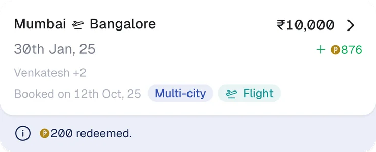
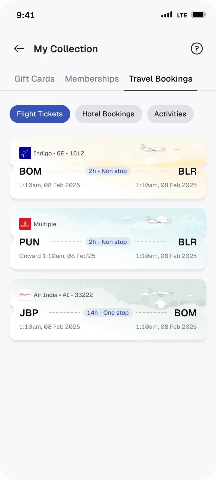
One card for every booking. History shows it as a payment, My Collection as something you keep, and both work the same for a flight, a hotel stay or an e-visa.
One booking details page. It lives in the partner's app, and History and My Collection both open the same page.
- Store
- Travel
- Flights
- Hotels
- Upcoming trips
- Visa
- Experiences
- History
- Booking detailsPartner PWA
- My Collection
- Booking detailsSame page
- Travel
Flights today. Every new category just adds a tile.
The booking as a transaction.
The ticket as something you keep.
Every screen shipped with its empty and error states
At OneCard, no screen ships without its empty and error states. For Travel it mattered even more, because half the journey ran on someone else's engine.
Empty states. Before someone's first booking, History and My Collection don't just say there's nothing here. They turn the empty space into a nudge to book.
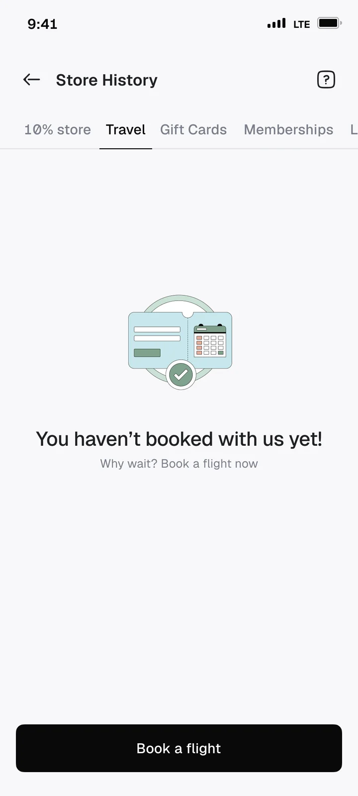
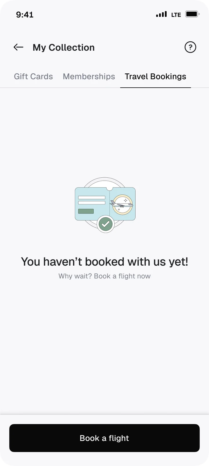
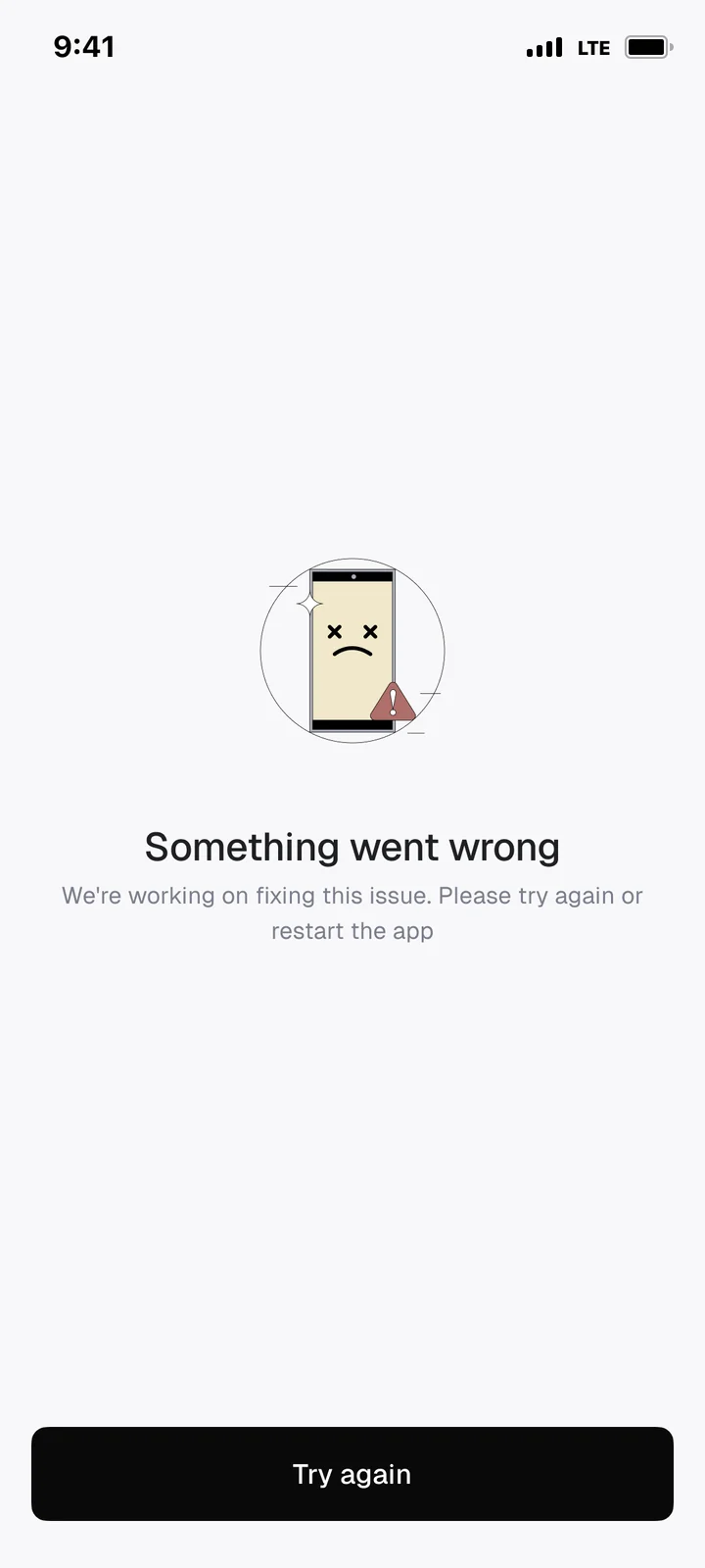
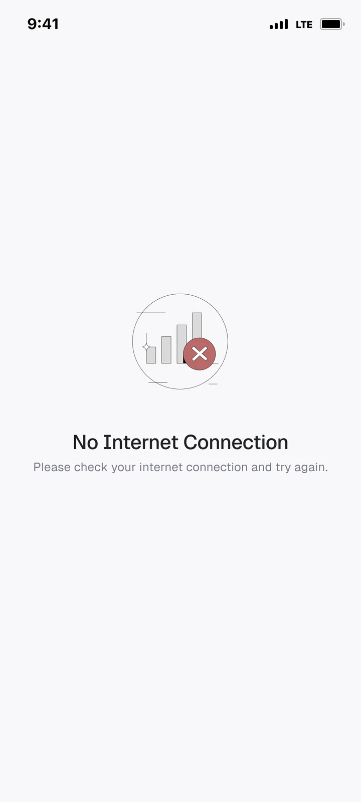
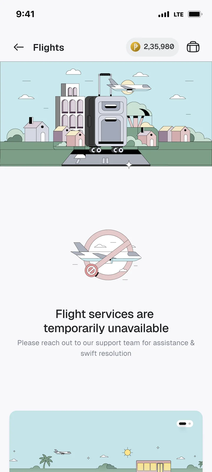
Error states. We designed for the three ways booking can break, and gave each one a clear next step: try again, check your connection, or reach support.
Conversion grew 2.2× in four months
Home-to-booking conversion, 3.0% → 6.6% in four months
of flight bookings used reward points, our one edge no other app had
Hotel bookings in August, launched on the same pieces with no rebuild
Home-to-booking conversion, flights
Share of people who searched for flights and went on to book
We forgot the people who had opted out of WhatsApp and email
At launch, booking updates went out three ways. For some cardholders, none of them landed.
Reported by customer supportA cardholder missed their flight, saying they never got a reminder.
So we shipped two fixes after launch.
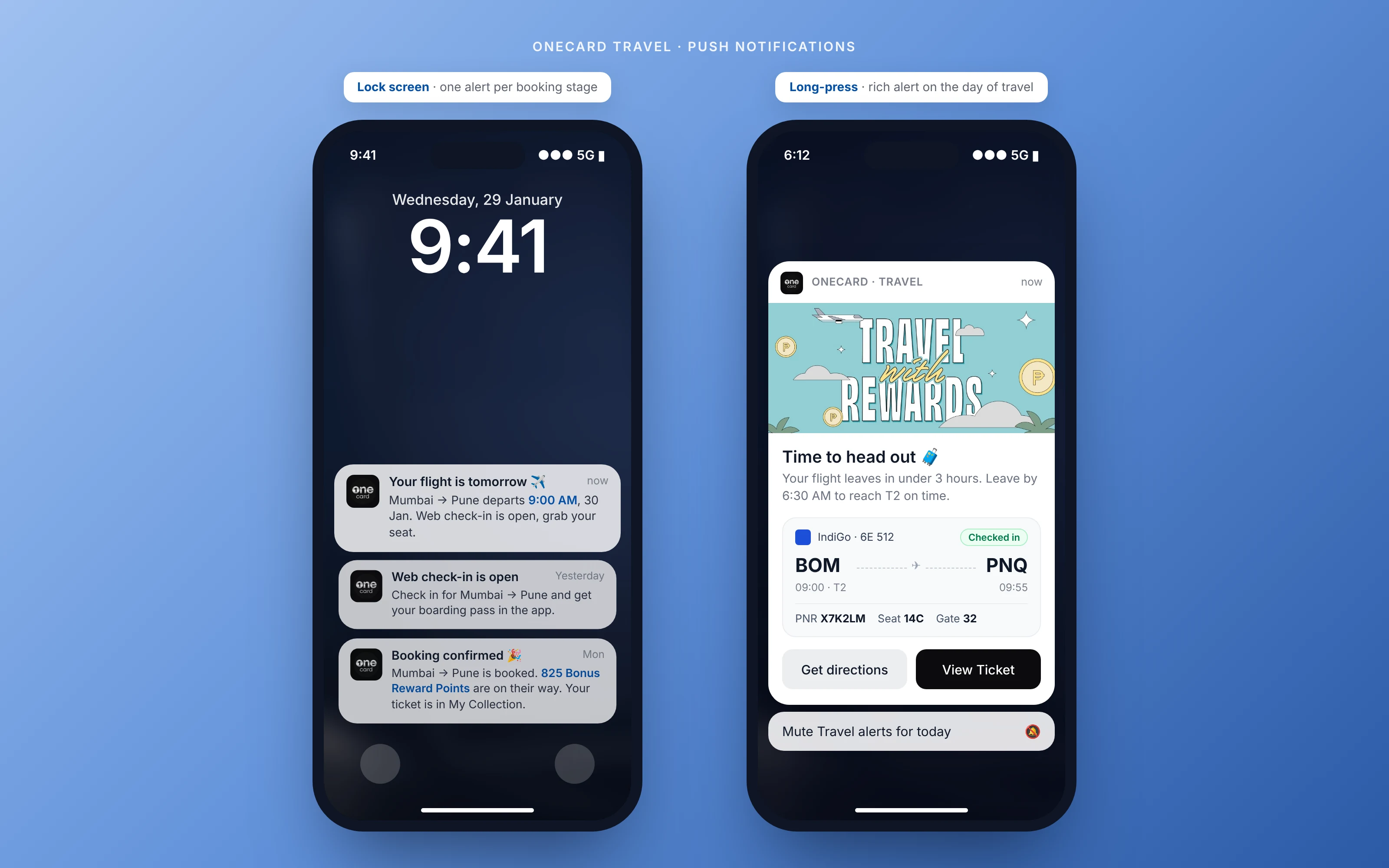
Fix 1 · Push notifications. Alerts that reach people without WhatsApp, email or opening the app, at every booking stage: booking confirmed, web check-in open, flight tomorrow, and a rich alert on the day of travel with the ticket one tap away.
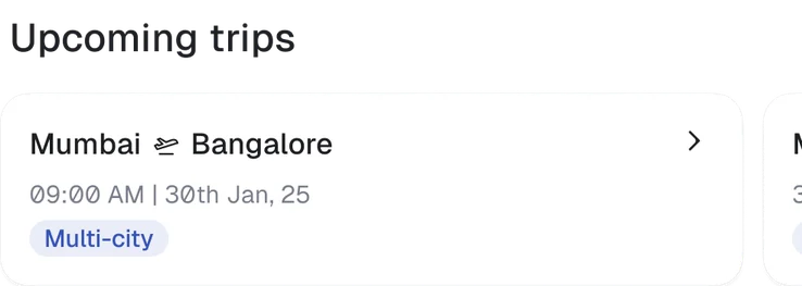
Your next trip at the top of the Travel page, where every booking starts.
Upcoming trips stayed off the home page
The home page is reserved for critical card actions. A trip card would sit in the second or third fold: clutter that nobody sees.
Upcoming trips live where people already look for them.
There's more behind this one
Some screens and numbers are under NDA. I'm happy to walk you through the full project on a call.
 Wizely·WealthTech & Digital Gold
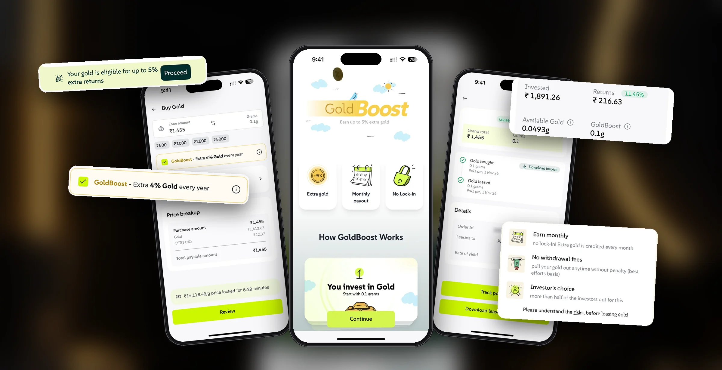
Turning 68% of Gold Portfolio Value Into Gold Lease with a Frictionless Buy Flow
Sole designer on GoldBoost, integrating an upfront leasing mechanism into the gold purchase journey — earning users 4% extra yield annually without locking capital or hurting conversions.